Overview
Ambee’s climate and environmental APIs power a wide range of businesses. Ambee Maps brings this data together as visual map layers, helping users explore climate conditions through historical data and forecasts. Over time, some usability challenges emerged that made it hard for users to interpret and navigate the data efficiently. The product team approached us to redesign the experience and address these friction points.
Team
Era (Product Design Lead)
Nishat Malik (UX Designer)
Anudeep K (Visual Designer)
Clients
Ambee
industry
Climate Tech

Problem
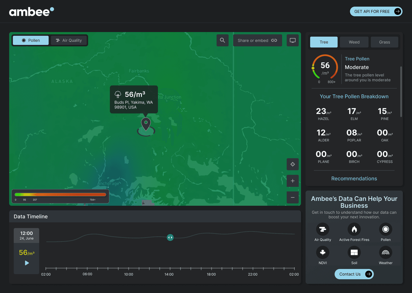
The dark UI reduced accessibility, impacting readability and contrast for some users.
Information architecture was inconsistent—air quality and pollen controls were separated, while tree, weed, and grass pollen selections lacked clear grouping.
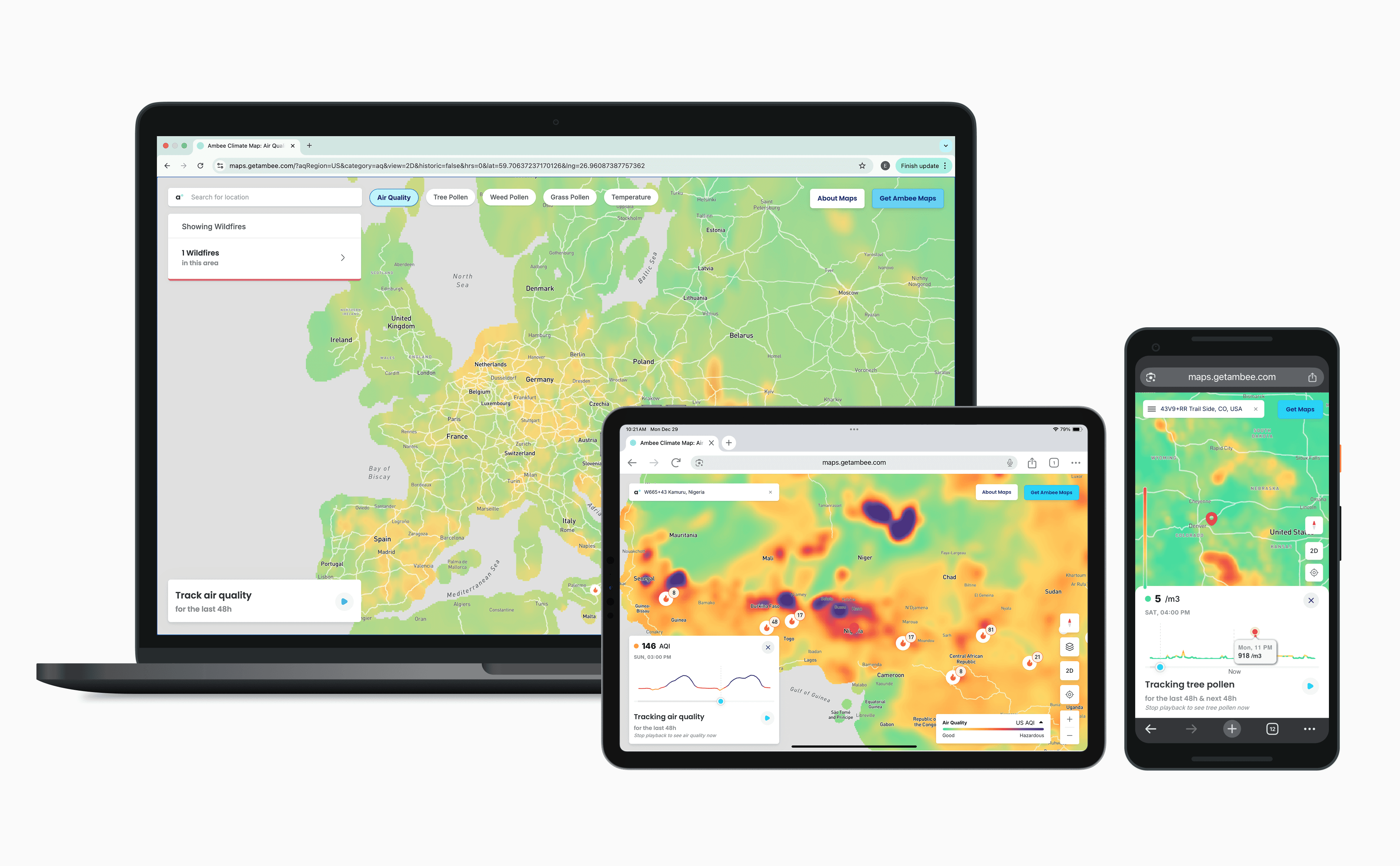
Although the map was the primary surface, it occupied only about two-thirds of the screen, with multiple UI elements competing for attention.
The playback controls consumed disproportionate screen space, limiting map visibility.
Iconography lacked consistency, and a prominent API promotion element took attention away from the what users actually came to do: explore the map.
Ambee maps before
Solution
Prior to the redesign, we had established Ambee Light, a unified design system for Ambee's enterprise products. After reworking the information architecture and resolving key user flows, we used Ambee Light to redesign and ship the updated Maps experience significantly faster. The system also enabled rapid iteration—allowing new layers such as wildfires and natural disasters to be added seamlessly in subsequent design cycles.